Website
Souqly Website
Souqly is a modern marketplace platform designed for the Algerian market, enabling users to discover, buy, and sell products locally. The experience focuses on simplifying product discovery through location-aware browsing, structured categories, search, filtering, and a clear marketplace interface while maintaining a trustworthy and scalable foundation for future growth.
Project Overview
Souqly Marketplace Website
Project Overview
Souqly is a modern marketplace platform designed specifically for the Algerian market, connecting buyers and sellers through a simple, structured, and location-aware shopping experience.
The product was designed around a fundamental challenge: online marketplaces can quickly become difficult to navigate when users are presented with large amounts of listings, categories, locations, and filters.
The goal was to create an experience where users can quickly understand what is available, discover relevant products, narrow results by category and location, and move naturally from browsing to purchasing or selling.
The Challenge
The marketplace needed to support different types of users and different browsing behaviors while keeping the experience simple.
Users need to be able to:
Discover products quickly
Search across a large marketplace
Browse structured categories
Filter products by relevant attributes
Search within specific categories
Understand product location and pricing immediately
Create an account with minimal friction
Return to previously discovered products
Eventually participate as sellers
At the same time, the platform needed a visual system that could scale as the number of categories, listings, and marketplace features grows.
Product Strategy
Rather than treating the marketplace as a simple collection of product cards, I structured the experience around the user's discovery journey:
Discover → Search → Filter → Compare → View → Buy
The interface therefore prioritizes:
Clear information hierarchy
Fast product discovery
Location awareness
Predictable navigation
Strong category structure
Minimal interaction friction
Consistent visual patterns
This creates a marketplace experience that feels familiar while remaining adapted to the Algerian context.
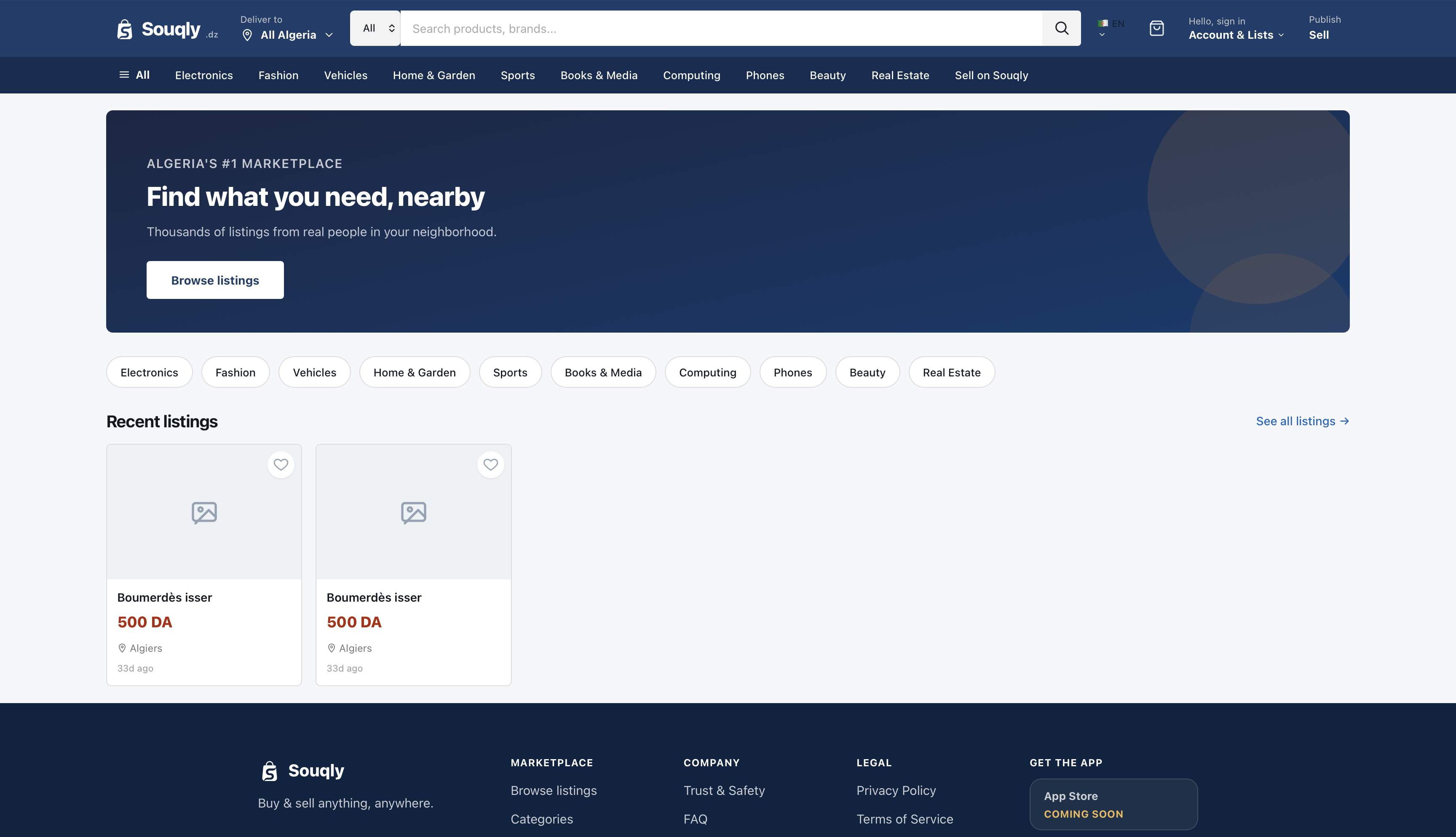
Homepage Experience
The homepage introduces the marketplace with a focused proposition:
Find what you need, nearby.
Instead of immediately overwhelming users with listings, the interface establishes the marketplace structure through:
Primary search
Location selection
Main categories
Recent listings
Clear navigation to browse the marketplace
The category shortcuts allow users to move directly into high-level product areas such as Electronics, Fashion, Vehicles, Home & Garden, Sports, Books & Media, Computing, Phones, Beauty, and Real Estate.
This creates multiple entry points into the marketplace depending on whether the user knows exactly what they want or simply wants to explore.
Location-Aware Discovery
Location is particularly important for a local marketplace.
The interface allows users to select their delivery/browsing location, including an **All Algeria** option and individual wilayas.
This establishes location as part of the core discovery experience rather than treating it as an advanced filter hidden deep inside the interface.
The result is a more relevant browsing experience for users looking for products available in their area.
Category & Search Experience
The category page was designed to provide a structured browsing environment.
Users can:
Search within a category
Navigate through subcategories
View listing counts
Sort results
Switch between grid and list views
Filter by location
Filter by price
Quickly reset active filters
The category header also provides contextual information about the current category and its available listings.
This helps users maintain orientation while navigating deeper into the marketplace.
Filtering & Sorting
Marketplace search can become frustrating when filters are difficult to understand or overly complicated.
The filtering experience therefore separates the most important controls into recognizable groups:
Subcategory
Allows users to narrow the current category.
Location
Allows users to refine results geographically.
Price
Allows users to define a price range and use predefined price ranges.
Sorting options provide additional control:
Most recent
Price: low to high
Price: high to low
Most viewed
The interface also makes active filters visible, giving users a clear understanding of why they are seeing a particular set of results.
Product Discovery
Product cards were designed around the information users need to make an initial decision:
Product image
Product name
Price
Location
Listing age
Save/favorite action
The visual hierarchy deliberately gives price strong prominence while keeping supporting information immediately accessible.
This allows users to scan multiple listings without opening every product page.
Empty States
Marketplace products inevitably encounter situations where a search or filter produces no results.
Instead of leaving the page empty, the empty state communicates:
No listings found
and provides useful next actions such as:
Clear filters
Return to home
Explore popular categories
This transforms a dead-end state into another opportunity for discovery.
Authentication Experience
The authentication flow was designed to keep account creation straightforward while communicating trust.
The registration experience includes:
Google authentication
Full name
Email
Password
Password confirmation
Terms and Privacy Policy
Clear account creation CTA
The login experience follows the same visual language and provides:
Google authentication
Email
Password
Password recovery
Remember me
Account creation path
The shared visual structure between registration and login reduces cognitive load and makes the authentication system feel like one coherent product.
Trust & Security
Trust is particularly important in a marketplace where users interact with other individuals.
The authentication experience reinforces this through clear messaging around:
Verified accounts
Secure platform
Protected data
Terms of Service
Privacy Policy
The goal is not to overload the interface with security messaging, but to provide enough reassurance at the moments where users are creating or accessing an account.
Responsive Product Thinking
The product was designed with scalability in mind rather than treating each screen as an isolated interface.
The underlying patterns are reusable across:
Homepage
Category pages
Search
Product discovery
Authentication
Account experiences
Seller experiences
This allows the marketplace to grow without requiring a completely different interaction model for every new feature.
UX Decisions
Several UX decisions were particularly important:
1. Search is always accessible
Search remains a primary interaction because marketplace users often arrive with a specific product in mind.
2. Categories provide exploration
Users who do not know exactly what they want can browse through structured categories.
3. Location is part of discovery
Because Souqly targets local commerce, location is surfaced early instead of being buried inside advanced settings.
4. Filters remain understandable
The filtering system exposes the most useful controls without overwhelming the user.
5. Product cards support fast scanning
Users can understand the essential information without opening every listing.
6. Empty states remain actionable
No-result situations always provide a clear next step.
Design System
The visual system uses a professional marketplace aesthetic built around:
Deep blue as the primary brand color
White surfaces
Soft neutral backgrounds
Clear borders
Strong typography hierarchy
Restrained shadows
Consistent rounded components
Familiar interaction patterns
The visual language is intentionally clean and trustworthy rather than overly decorative.
This creates a foundation that can scale across a large marketplace while keeping the interface recognizable and consistent.
My Role
Product Designer & Full-Stack Developer
I worked across both the product experience and the technical side of the project, combining product design thinking with full-stack development knowledge.
My responsibilities included:
Product UX strategy
Information architecture
User flow design
UI design
Search and discovery experience
Category architecture
Filtering and sorting UX
Authentication experience
Responsive interface design
Design system decisions
Frontend implementation
Backend/product architecture considerations
This combination allowed design decisions to be made with a strong understanding of how the final product would actually be built and scaled.
Outcome
Souqly evolved into a structured marketplace experience designed around a simple principle:
Make local product discovery easier
The resulting experience gives users multiple ways to discover products while maintaining a consistent interaction model across search, categories, filtering, authentication, and marketplace navigation.
The product foundation is also designed to support future marketplace capabilities such as richer seller experiences, more advanced search, personalized discovery, and expanded commerce workflows.
Technologies Used
Node.jsNext.jsReactFigmaDockerSupabasePostgreSQLTailwind CSS
Project Information
- Category
- Website
- Last updated
- September 22, 2026
- Links
- Live site